« Previous
Next »
« Previous
Next »
MICROSOFT EXCEL 2013
CHARTS
Charts are visual representations of worksheet data. A chart often makes it easier to understand the data in a worksheet. Because a chart presents a picture, charts are particularly useful for summarizing a series of numbers and their interrelationships. Excel provides you with the tools to create a wide variety of highly customizable charts.
TYPES OF CHARTS
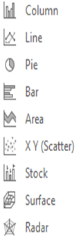
There are various chart types available in MS Excel as shown in below.- Column: Column chart shows data changes over a period of time or illustrates comparisons among items.
- Line: A line chart shows trends in data at equal intervals.
- Pie: A pie chart shows the size of items that make up a data series, proportional to the sum of the items. It always shows only one data series and is useful when you want to emphasize a significant element in the data.
- Bar: A bar chart illustrates comparisons among individual items.
- Area: An area chart emphasizes the magnitude of change over time.
- X Y Scatter: An xy (scatter) chart shows the relationships among the numeric values in several data series, or plots two groups of numbers as one series of xy coordinates.
- Stock: This chart type is most often used for stock price data, but can also be used for scientific data.
- Surface: A surface chart is useful when you want to find optimum combinations between two sets of data. As in a topographic map, colors and patterns indicate areas that are in the same range of values.
- Radar: A radar chart compares the aggregate values of a number of data series.
- Select the data for which you want to create chart.
- Choose Insert Tab.
- Select a chart type from the Chart group.
Or
Choose Recommended Chart option for select chart type according to your data. - Click on chart
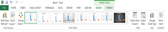
- It will display Design tab for editing as illustrated below.
- From the Insert tab, click on “Pie” and select the appropriate type of pie chart
- You should get something that looks like this….
- An Excel worksheet database/list or any range that has labeled columns.
- The data in a PivotTable cannot be changed as it is the summary of other data. The data itself can be changed and the PivotTable recalculated. The PivotTable can be reformatted.
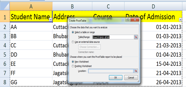
- Prepare the MS Excel data sheet (table) and click any where it.
- Choose insert tab.
- Click on Pivot Table then Create Pivot Table dialog box will appear select with database table.
- You can choose worksheet where to insert Pivot Table, like New or Existing worksheet.
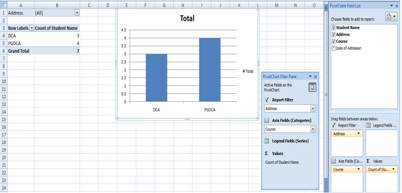
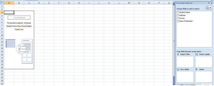
- Click on OK to insert Pivot table at your specified sheet and this will generate the Pivot table pane as illustrated below. You can select fields for the generated pivot table.
- In above there are various options available in Pivot table pane. You can select fields and drag into appropriate place for generated pivot table.
- Column labels: A field that has a column orientation in the pivot table. Each item in the field occupies a column.
- Report Filter: You can set the filter for the report as area (district) then data gets filtered as area wise.
- Row labels: A field that has a row orientation in a pivot table. Each item in the field occupies a row.
- Values area: The cells in a pivot table that contain the summary data. Excel offers several ways to summarize the data (sum, average, count, and so on).
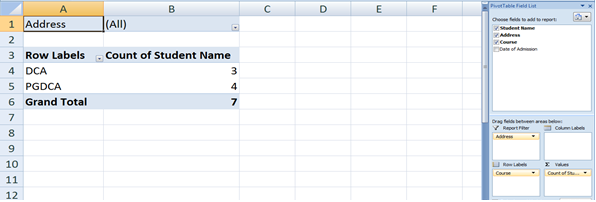
- After giving field into the table, it will generate pivot table with data as below.
- Select appropriate chart type and you will see the result as below.
CREATING CHART
To create charts follow below steps.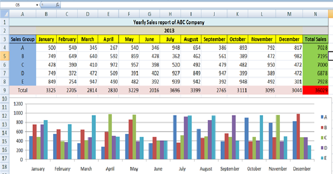
EDITING CHART
You can edit the chart after you have created it.MAKING A PIE CHART
For an example we’ll need some actual data to chart so generate a list of monthly expenses such as this one. Select the data that you wish to chart (including the labels: TV, Phone, etc...).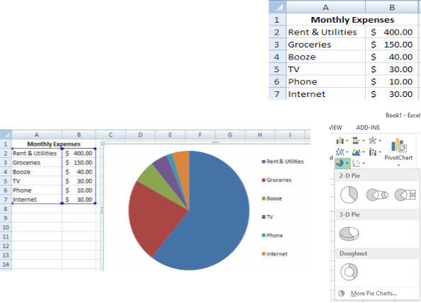
PIVOTTABLES
A pivot table is a dynamic summary report of specified calculations generated from data a database. The database can be a table in the worksheet or in an external data file. It is called a PivotTable because the headings can be rotated around the data to view or summarize it in different ways.The source data can be:
To create a PivotTable:
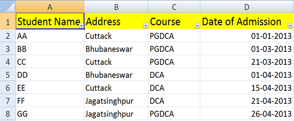
Now let us see Pivot table with the help of example. Suppose you have a data base of students records with various courses and want to see summarized data of student information per course then you can use Pivot table for it.Steps:
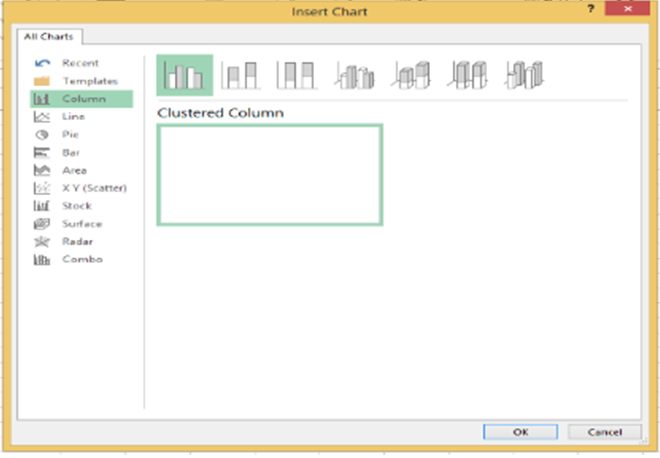
YOU CAN SELECT CHART IN PIVOT TABLE
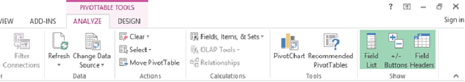
A pivot chart is always based on result of a pivot table.Pivot charts are available under Analyze tab when your cursor is on pivot table result.
 When you click on PivotChart it will display insert chart dialog box as illustrated right.